The problem
A health insurer carries the cost of care across a whole region, and the view it gets first is the regionwide average, smooth by construction. It hides that cost concentrates in a thin band of the sickest patients, that Medicaid exposure is worst at the small rural hospitals, and that those are the facilities a network cannot route around if one closes. A hospital’s own finance dashboard answers how much was billed, a different question from where the region is fragile.
The approach
The goal is a model that survives interrogation: one that holds up when a reviewer filters it, cross-checks it, and re-derives the numbers, not one that only looks right at a glance. Picture a wheel: one hub table holding every discharge, six spokes to lookup tables, built as a real star schema from messy government data. It reconciles exactly to the raw source, 143,613 to 143,613, with zero orphan foreign keys, and every measure computes as live DAX over that one shared model, so a single slicer filters all six pages at once instead of driving six static charts.
The questions
Framed from a payer’s perspective, not a hospital’s: where does cost concentrate, how do charges compare to estimated cost, who pays and where is Medicaid exposure highest, does length of stay differ by location, and how does urban utilization compare to rural.
What causes hospital risk to hide inside a healthy regional average?
A regionwide average smooths away risk that concentrates at a few small rural hospitals. Disaggregating 143,613 real discharge records shows the top 10% of admissions drive 40% of cost, and one condition, septicemia, accounts for $221M, 9.8% of regional spend. Rescoped to actual facility designation, Ellis and Nathan Littauer Hospitals rank highest for network-adequacy risk.
What the data says
Cost is sharply concentrated, and two independent cuts agree.
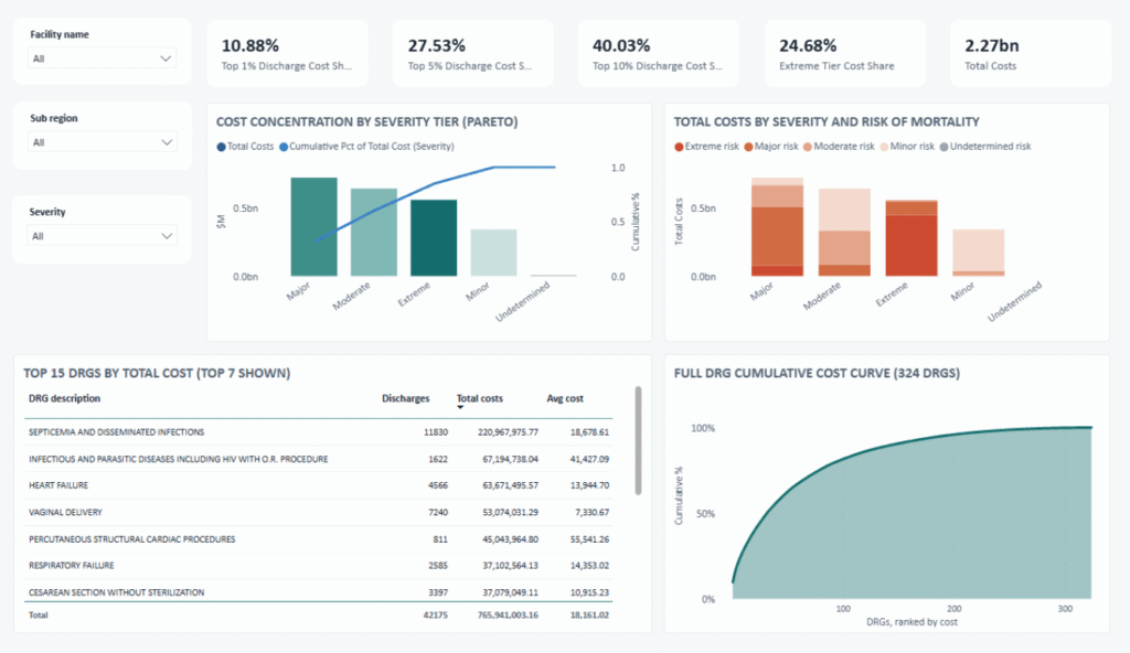
The highest severity tier is under 10% of admissions but drives 24.7% of cost. A sharper cut, ranking all 143,613 individual discharges, says it harder: the top 10% of admissions account for 40% of spend, the top 1% for 11%. Two different lenses landing on the same conclusion is what makes it load-bearing.
So what: care-management effort belongs on a narrow high-cost band, not spread evenly.
One condition is a $221M line item.
Septicemia and serious infections is the single largest cost driver in the region: $221M, 11,830 discharges, 9.8% of all regional spend.
So what: if a payer had to pick one condition to build an early-intervention program around first, the data names it.
Length of stay tells an access story, not an efficiency one.
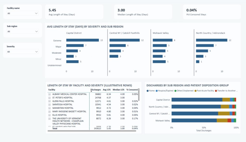
Rural Mohawk Valley shows shorter stays than the urban Capital District for the sickest patients (7.6 vs. 12.6 days). Read alone, that looks like a rural efficiency win; cross-referenced with where patients go after discharge, it more likely reflects limited on-site capacity and transfers out.
So what: read it as a capacity and post-acute access gap when planning network adequacy, not a quality signal.
A composite risk score caught its own methodology bug.
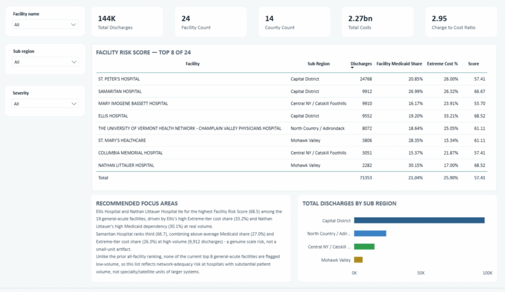
Combining Medicaid dependency, size fragility, and cost complexity into one ranked score first put two tiny specialty campuses at the top, an artifact of the size measure rewarding smallness.
Rescoped to actual CMS facility designation (19 general-acute facilities, not 24), the corrected top is Ellis Hospital and Nathan Littauer Hospital, tied at 68.5.
So what: Nathan Littauer, a real rural hospital with real volume and a 30% Medicaid share, is the facility a payer should watch first for network-adequacy risk, not a false positive from a specialty-campus edge case.
Design decisions worth noting
- Real data got real judgment calls, logged, not hidden. 57 top-coded “120+” length-of-stay rows were floored and flagged rather than dropped; 70 exact-duplicate rows were kept, not deduped, since the file has no patient or row identifier to safely tell two real patients from one duplicate.
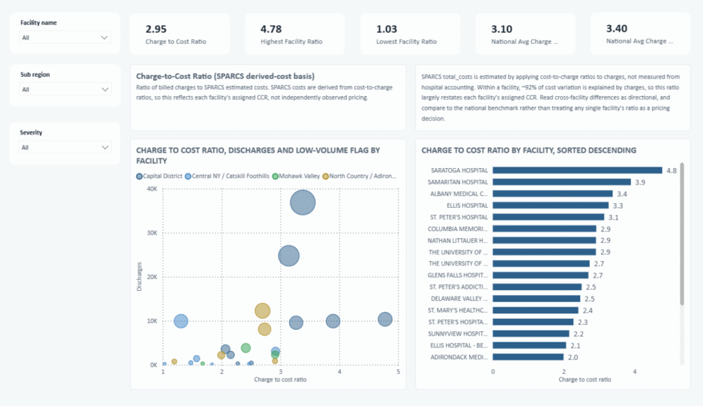
- The charge-to-cost ratio is a derived figure, not observed pricing. Disclosed at 2.95x, since SPARCS costs are themselves estimated from charges, not independently observed.
- Medicaid share is reported as a band, not a single number. A large “unspecified managed care” bucket can’t be split at the row level, so the finding is a floor-to-ceiling range, 16.4% to 27.1%, disclosing the estimate’s limit as part of the finding, not a footnote.
What this demonstrates
Reading a hospital region as a payer means asking where cost and access risk concentrate, not how much anyone billed. The regionwide average said this region was healthy; disaggregated, the same data named the two hospitals to watch first.
The habits behind that generalize past healthcare: measure anything load-bearing two independent ways, hold severity constant before comparing places, and publish the soft numbers as ranges with named assumptions. Any analysis someone else will pull apart stands or falls on the same discipline.
Full findings, design decisions, and the technical build in the GitHub case study.
Common questions
Is the charge-to-cost ratio the hospital’s actual pricing?
No, it’s a derived figure, not observed pricing, disclosed at 2.95x since the underlying SPARCS costs are themselves estimated from charges, not independently observed.
Why is Medicaid share reported as a range instead of one number?
Because a large “unspecified managed care” bucket can’t be split at the row level. The finding is a floor-to-ceiling range, 16.4% to 27.1%, disclosing the estimate’s limit as part of the finding.